Background
This project was completed as part of my UX design diploma from the UX Design Institute. All aspects of the work were carried out independently by me.
The Problem
Flight booking websites can often be difficult to navigate, diminishing the enjoyment of planning your next adventure. Lengthy and complicated booking processes, with too many steps, often result in users abandoning their carts mid-booking, leading to lost revenue for travel companies and frustration for customers.
Additionally, these sites frequently suffer from complex navigation, unclear labels, and an overwhelming amount of information on the homepage. Another key issue is the excessive redundancy of information, which can discourage users from completing their booking.
The Process
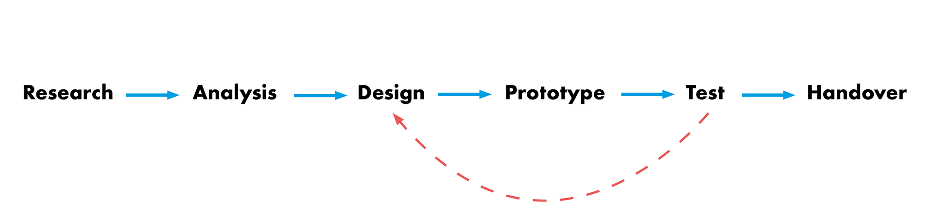
Research
Various research methods were employed to identify the key issues with flight booking sites and to gather sufficient qualitative and quantitative data, laying the groundwork for analysis and the design of a more user-friendly product.
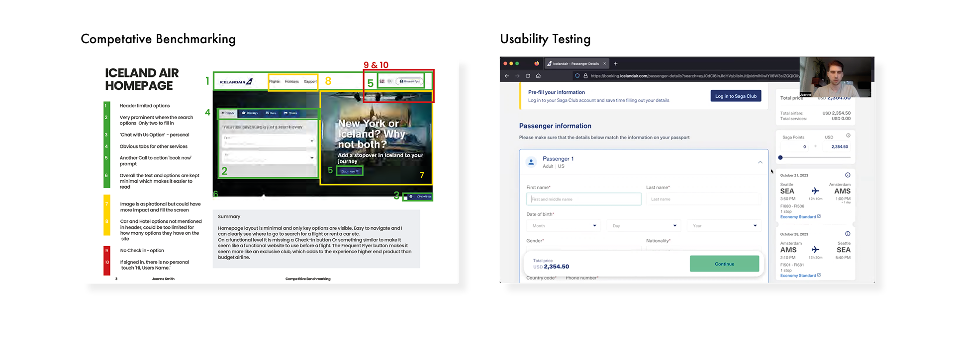
Competitor Benchmarking
To understand industry standards and identify which elements of existing travel websites are successful or ineffective, I researched industry leaders and analysed how they structure the flight booking process. This included evaluating layout, navigation, the number of steps in the process, calls to action (CTAs), and other successful or unsuccessful elements on the site.
Usability Tests
I conducted five usability tests on the booking process of various airline websites, which provided valuable insights into user pain points and mental models during the flight booking process. These tests highlighted several issues and offered key insights into different user experiences.
Analysis
To make sense of the various research methods gathered, I applied analysis techniques to structure the information and draw meaningful conclusions from the findings.
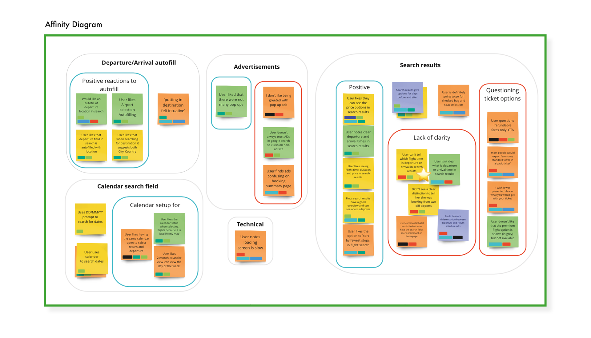
Grouping - Affinity diagram
The first step in the analysis was to create an affinity diagram to organise the information gathered from all the research methods. This system broke down key points from each interaction, mental model, and opinion into separate post-it notes, allowing us to structure the data into understandable categories. A group of three of us reviewed each grouping and discovered that areas such as overall navigation and visibility were identified as problematic, while others—such as the calendar search field and adding passengers—received much more positive feedback.
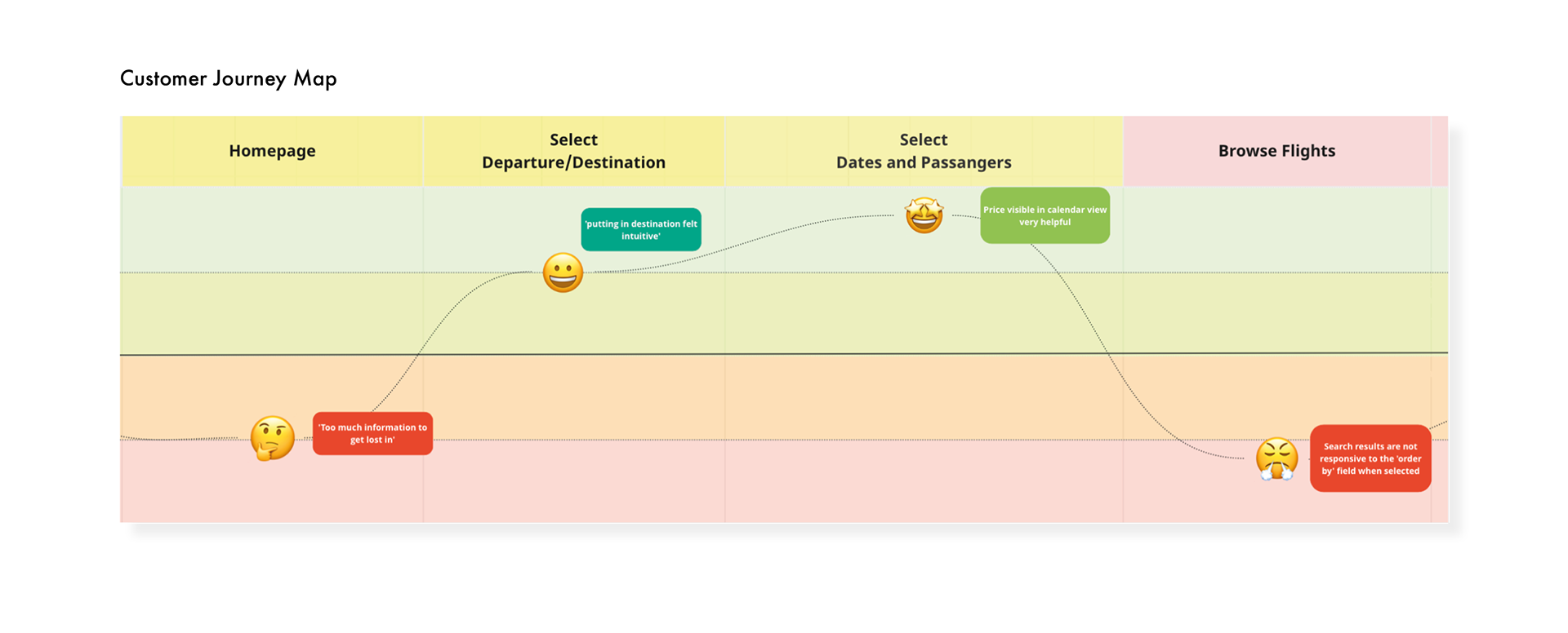
Customer Journey Map
As a further step in the analysis process, I organised the research findings into chronological steps throughout the booking process to better understand where issues occurred and which stages were functioning successfully. Overwhelmingly, the flight search input was a positive experience, but browsing for flights revealed the biggest challenges.
Design
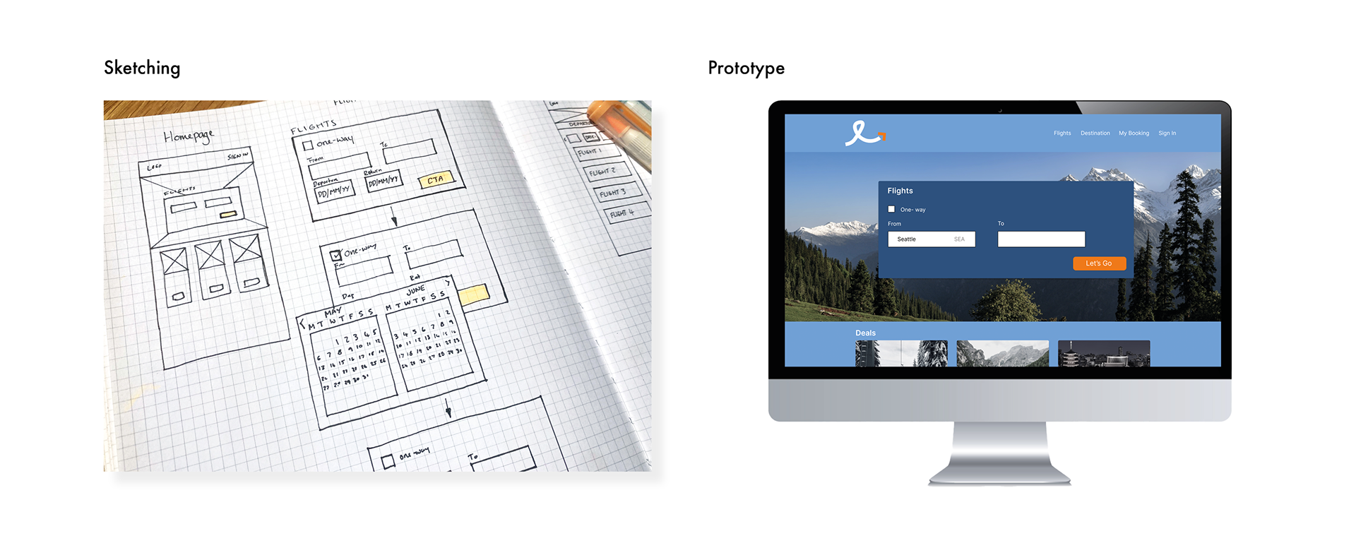
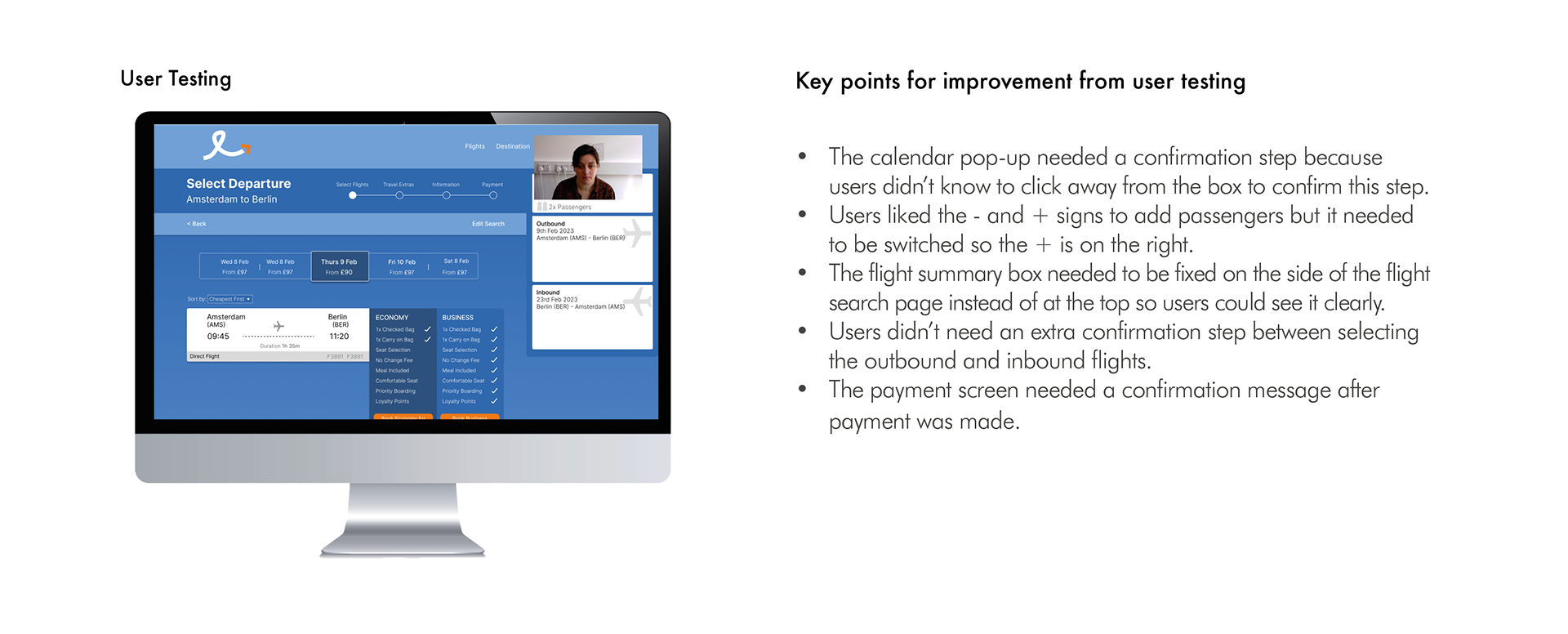
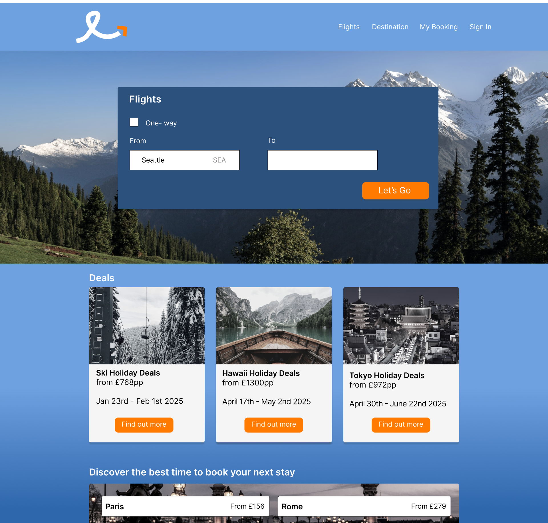
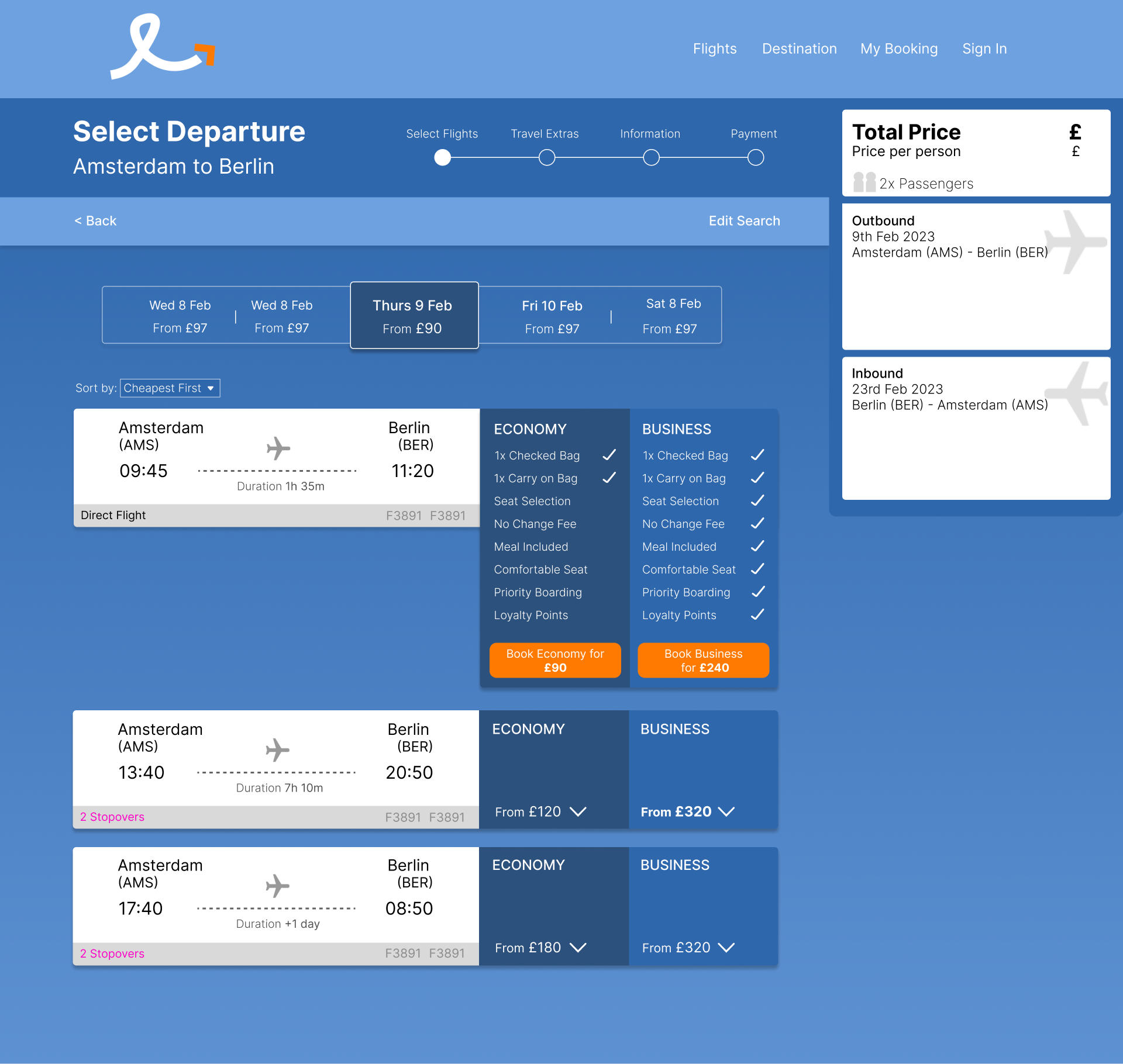
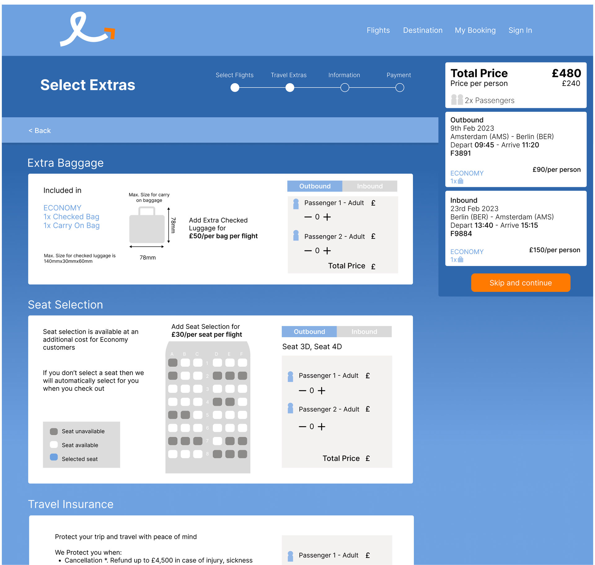
The analysis provided great insights into improvements for the flight booking process and which elements I need to focus my design on. The first stage is to draw out each screen state and develop the design through sketching so ideas are kept loose. I created a medium-fidelity prototype of the site to better understand the design intricacies and test it with users. The prototype allows users to book a return flight for two from Amsterdam to Berlin, selecting the first flight of the day for both. I conducted a series of user tests to refine the design and gain insights into the different experiences users have when booking a flight on the prototype.
Reflections
The Process
The research process provided valuable insights, especially given the large number of airline booking sites and the many examples—both good and bad—of how to structure and design this complex process. Analysing all the data helped bring everything together, and I was pleased to see patterns emerge, which guided my focus during the design phase. The design process itself was greatly aided by hand-sketching multiple variations of ideas before moving on to Figma to create the prototype.
The Results
I am satisfied with how my product performed during the final stages of testing, and I’m delighted to have created a product that functions well and is easy to use. Reflecting on the process, I found that the final usability tests conducted at the design stage were the most valuable, revealing both what worked well and what could be improved.
I am satisfied with how my product performed during the final stages of testing, and I’m delighted to have created a product that functions well and is easy to use. Reflecting on the process, I found that the final usability tests conducted at the design stage were the most valuable, revealing both what worked well and what could be improved.
In the future, I hope to expand the research stages to gather an even larger set of data to work with. Additionally, I believe the affinity diagram would be even more effective if conducted with stakeholders or other designers on the team.